UH does work well with it. But my eyes still can't handle that pink.
HHOP is pretty cool though.
The rest of them are okay, but would be better if they just had red as another secondary color. May be an update will allow us to customize the automatic detection by selecting an area or something.
,,Artist? Come on now... I hit things for a living!"
- Stevo32
MMhhhh... sswwwshhhh... just can't get enough of that coke... aawbrrrrrbr ...
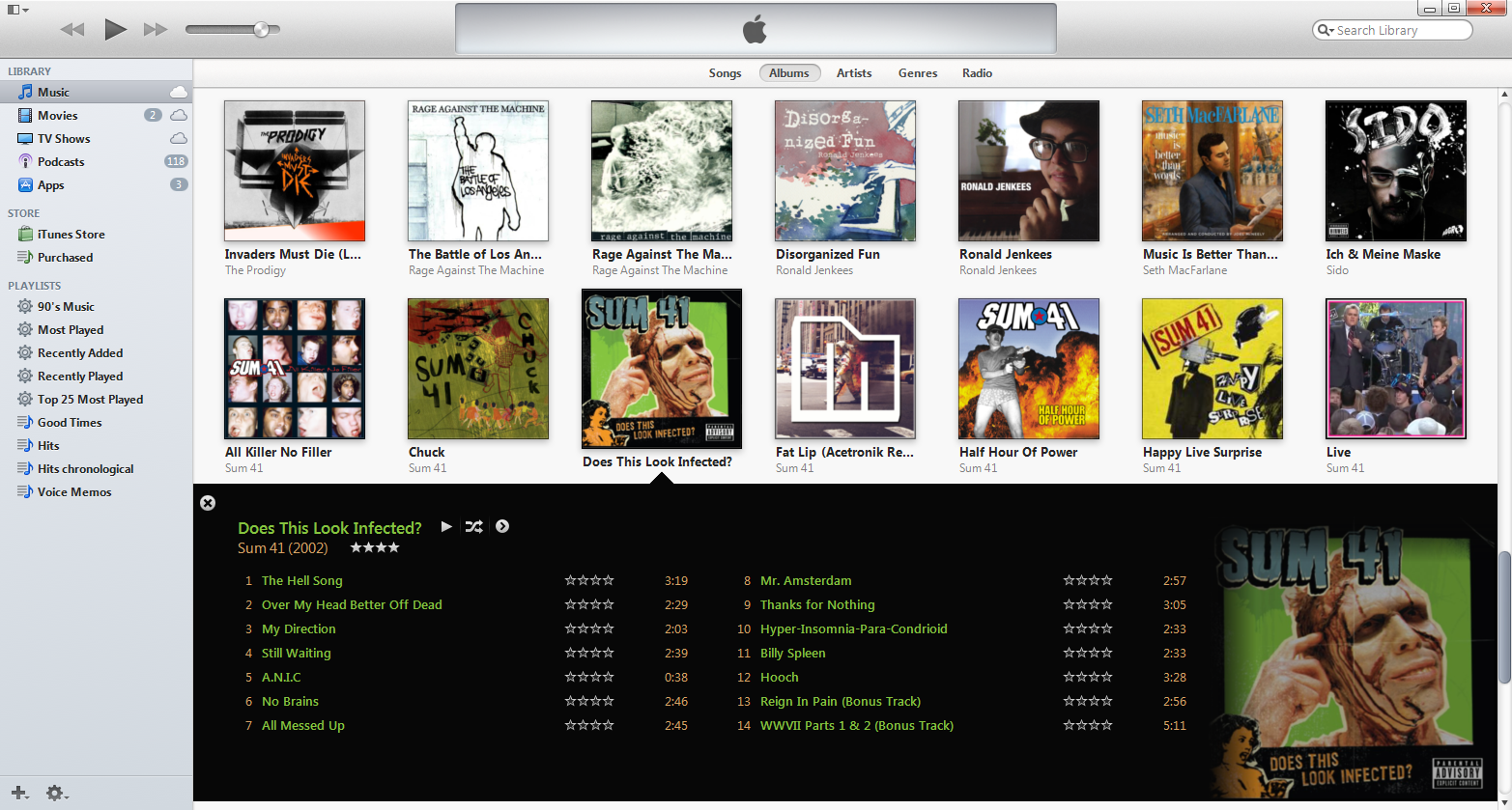
Those are the first albums I checked out when I updated my iTunes the other day. Agreed! I wish they did away with the gimmicky reflection and fades on the edges of the album art. Other than that, the color detection is a great new addition.
I hate the faded edges. They should make the album art smaller and put a border around it. A lot of albums just look really bad faded out around the edges, plus the detected colour doesn't match the album cover (see Green Day's Uno Dos & Tre).
If you like the classic sidebar on the left instead of a the new dropdown menu, there is an option for it.
The only thing I can complain about right now, is the new taskbar icon, which is even worse than the last one, which was bad enough already.
,,Artist? Come on now... I hit things for a living!"
- Stevo32
MMhhhh... sswwwshhhh... just can't get enough of that coke... aawbrrrrrbr ...
Yeah, I enabled the sidebar back in as well. I'm not a fan of the default, but I'm glad they added some customization options. THANK GOD they added the colors back.


