No, I have uni work to do, work work to do, crimes to commit, pick up my new car wednesday, rim a pigeon, visit the Dentist, and fix this place up (the Spanish version of the new theme is fucked).
I also need to clean my gmail out, I only have 450mb left. Or I may just buy another 20gig for $5/year.
I sorta got a sneak preview of it but i kept it quiet hehe
Nic ive said this to Boni also yano the icons beside a sections that change colour when there is a new topic or post in that section. I think that the light blue is a lil bit difficult to make out at times and feel that a darker colour such as the red used in the new layout photo would be better or maybe thats just me. just that blue is a lil hard on the eyes and hard to make out on a laptop screen at times
Mr-David-Blues wrote:I sorta got a sneak preview of it but i kept it quiet hehe
Nic ive said this to Boni also yano the icons beside a sections that change colour when there is a new topic or post in that section. I think that the light blue is a lil bit difficult to make out at times and feel that a darker colour such as the red used in the new layout photo would be better or maybe thats just me. just that blue is a lil hard on the eyes and hard to make out on a laptop screen at times
Totally agreed. My eyes still haven't get used to this, so it would be appreciated to change the color either darker, or to a color that fits with the new banner (red?).
yeah same with all the highlighted blue font could be changed to suit the new layout
just a small suggestion really like the new layout tho
Jake! wrote:It's not THAT hard to tell the difference. I can see it fine.
I'm sure it isn't, but my eyes aren't that perfect. I've had this layout for quite some time now, and still it's hard to notice the baby blue. Thanks to the new-posts function though, the problem isn't that annoying.
Mr-David-Blues wrote:I sorta got a sneak preview of it but i kept it quiet hehe
Nic ive said this to Boni also yano the icons beside a sections that change colour when there is a new topic or post in that section. I think that the light blue is a lil bit difficult to make out at times and feel that a darker colour such as the red used in the new layout photo would be better or maybe thats just me. just that blue is a lil hard on the eyes and hard to make out on a laptop screen at times
Totally agreed. My eyes still haven't get used to this, so it would be appreciated to change the color either darker, or to a color that fits with the new banner (red?).
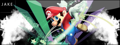
Don't worry. I've been meaning to change it, just been real busy. They will be red X's. To be exact, replica's of the X's on Deryck's guitar.
Mr-David-Blues wrote:I sorta got a sneak preview of it but i kept it quiet hehe
Nic ive said this to Boni also yano the icons beside a sections that change colour when there is a new topic or post in that section. I think that the light blue is a lil bit difficult to make out at times and feel that a darker colour such as the red used in the new layout photo would be better or maybe thats just me. just that blue is a lil hard on the eyes and hard to make out on a laptop screen at times
Totally agreed. My eyes still haven't get used to this, so it would be appreciated to change the color either darker, or to a color that fits with the new banner (red?).
Don't worry. I've been meaning to change it, just been real busy. They will be red X's. To be exact, replica's of the X's on Deryck's guitar.
Sounds great!
Weren't they already in TNS V1 design when the site started? Or am I recalling it wrong?
To be honest, I do not remember. I have made so many designs for TNS over the past few years. Most of them, I end up trashing.
Aww, that's a shame. It would've been cool to see all those designs.
I wish I had your talent,Nic ...I am supposed to make something in Photoshop ...something on theme as time goes by ...there should be some clock ...well fuck him I have no fantasy XD
This is Mark Allen Hoppus. He likes long walks on the beach. This, this is travis barker. He likes to be read poetry just before sunset. And me, I like to stick small pieces of furniture up my butt.
I spy on my dad while he is taking a shower just like everyone else
Mark: Sometimes when I talk in 3rd person i end up calling tom mark
Tom:Yea than he starts touching me and i think thats masturbation
Some people think were idiots or perverts dont argue were both.
"i think we're gonna be one of those bands thats around forever and even makes records, even if noones buying them and using them for toilet paper...but we'll still make them because we'll be the best fuckin toilet paper anyones ever used...." - Tom Delonge