I really liked the perspective of yours, I admit guitars are pretty hard to draw and thanks! Originally the reflection in the eyes was extremely sublte but I made it more obvious because they'd miss it otherwise and also I wasn't sure if it was being printed off so I didn't know how it'd turn out.Volted wrote:Max wrote:Your design was great man. It's one of the best for sure, it'd be the best if the guitar was a little bit neater and the space on the left was filled with something :)Volted wrote:oh hey, congrats to the winners. i like that they're not mere use of band photos with photoshop. very nice job.
i really liked lisaNL (1) and silverdolphin (1). heather, yours is really good; why didn't you submit it? and thanks for including mine in the notable, haha.
but again, congrats to the winners, the contest was nice; it gave me a chance to see different perspectives of album covers speculated by fans.
Thanks :)Resident Scumfuck wrote:Congrats to everyone who won. My favorite was the gasmask one.
hey, thanks. i'm actually really bad at drawing guitars because i can't draw straight lines for the strings, and guitars are just one of those things i can't really draw. and i also used a strange perspective for my design (the road is curved and the horizon is curved) so i realized i had that blank space on the left and i didn't know what to do with that. i was also hoping the band would catch the bottle of jack daniels i drew on the railing.
i really liked yours too; the gas mask with the brick wall background gives your album design a lot of intensity. the only thing i didn't like with yours is the image of sum 41 in the gas mask, but that's just my personal feeling; i generally don't like the use of photos done by other people in my own, but other than that, yours was really great. love the blood spatter on the side to contrast with the band name font and your choice of font for the album name gives it a serious feeling.
Contest Winners
-
Max

- Dr. Rocco
- Posts: 1016
- Joined: Fri Dec 19, 2008 6:11 pm
- First name: Max
- Age: 32
- Gender: ♂
- Instrument 1: Fender Tele Deluxe
- Instrument 2: Gibson Les Paul
- Instrument 3: Epiphone Casino
- Twitter: maxwood
- Location: Manchester, UK
Re: Contest Winners
-
SumGeek

- Does This Look Infected?
- Posts: 1858
- Joined: Thu Apr 08, 2010 7:19 pm
- First name: Chelsea
- Age: 23
- Gender: ♀
- Twitter: chelsealouanne
- Location: Hamilton, Ontario, Canada.
- Contact:
Re: Contest Winners
That's what I was thinking!Nic wrote:I think it would look AMAZING if the text was like not a font. For example, write it out on paper with a sharpie and scan it in and PS it into the photo. It just looks more real that way.SociallyInept wrote:That definately would have been a winner, it looks kickass!fenderrocks wrote:btw this was my concept, I never posted it up on flicker, I just made it for fun

But otherwise, great cover Heather!
Congrats to the winners.


-
HugoDisasters

- Jessica Kill
- Posts: 2979
- Joined: Sat Jan 09, 2010 4:19 pm
- Gender: ♂
- n00b: You.
- AKA: HHUGGZ
- Instrument 1: Guitar
- Instrument 2: Vocals
- Instrument 3: Piano
- Location: Sweden
Re: Contest Winners
I didn't win, Well ok. I could get those items on Ebay anyways... :(
At least i deserve the title TNS Douchebag...
At least i deserve the title TNS Douchebag...
Click to view the fullsize image.http://i34.tinypic.com/10e1sli.jpg[/imgwidth]
-
patenttiftw
- Dr. Dynamite
- Posts: 1208
- Joined: Thu Jun 21, 2007 8:57 pm
- First name: Aarne
- Age: 22
- Gender: ♂
- n00b: God.
- 360 Gamer Tag: partonen2
- Instrument 1: guitar
- Last.fm Username: Gobbed
- Location: Savonlinna city!, Finland
- Contact:


-
shadowred3

- Newbie
- Posts: 97
- Joined: Wed Jul 07, 2010 6:25 am
- First name: jonah
- Age: 18
- Gender: ♂


-
Heather

- Moderator
- Posts: 3071
- Joined: Tue Nov 11, 2008 10:43 pm
- First name: Heather
- Age: 26
- Gender: ♀
- Instrument 1: vocals
- Instrument 2: guitar
- Twitter: @HMac41
- Location: South Carolina
- Contact:
Re: Contest Winners
Just an update. I was planning on going to the post office today, but I've been sick for like 3 days, so I'm going Monday or Tuesday of next week. Everything is packed, just needs to be shipped

-
Jesus Christ Supermarket

- Hooch
- Posts: 491
- Joined: Thu Sep 10, 2009 10:23 pm
- First name: Scott
- Age: 18
- Gender: ♂
- Location: Iowa
Re: Contest Winners
I wouldn't mind if Nic's or Volted's was the actual album cover. (Chances are their style will be worse)
Last Listened to:
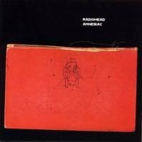
Radiohead- Amnesiac
9/10
Favorite song: Pyramid Song/ Knives Out
Radiohead- Amnesiac
9/10
Favorite song: Pyramid Song/ Knives Out
-
Nic

- Administrator

- Posts: 4451
- Joined: Wed Apr 11, 2007 11:16 pm
- First name: Nic
- Age: 26
- Gender: ♂
- Twitter: nicbavetta
- Location: Illinois
- Contact:
Re: Contest Winners
Get well!fenderrocks wrote:Just an update. I was planning on going to the post office today, but I've been sick for like 3 days, so I'm going Monday or Tuesday of next week. Everything is packed, just needs to be shipped

-
I'm A Cunt [*banned*]
- Resident Skumfuk
- Posts: 5928
- Joined: Sat Feb 02, 2008 3:42 pm
- First name: Charley
- Age: 17
- Gender: ♂
- 360 Gamer Tag: KiNGxCRuSaDeRXx
- Instrument 1: Guitar
- Location: South carolina
Re: Contest Winners
Carrying Sum 41's baby eh must be hard for you.fenderrocks wrote:Just an update. I was planning on going to the post office today, but I've been sick for like 3 days, so I'm going Monday or Tuesday of next week. Everything is packed, just needs to be shipped
-
Heather
- Moderator
- Posts: 3071
- Joined: Tue Nov 11, 2008 10:43 pm
- First name: Heather
- Age: 26
- Gender: ♀
- Instrument 1: vocals
- Instrument 2: guitar
- Twitter: @HMac41
- Location: South Carolina
- Contact:
Re: Contest Winners
ThanksForTheVenom wrote:Carrying Sum 41's baby eh must be hard for you.fenderrocks wrote:Just an update. I was planning on going to the post office today, but I've been sick for like 3 days, so I'm going Monday or Tuesday of next week. Everything is packed, just needs to be shipped
-
Heather
- Moderator
- Posts: 3071
- Joined: Tue Nov 11, 2008 10:43 pm
- First name: Heather
- Age: 26
- Gender: ♀
- Instrument 1: vocals
- Instrument 2: guitar
- Twitter: @HMac41
- Location: South Carolina
- Contact:
Re: Contest Winners
Didn't make it to the PO yet. I had some school stuff to take care of Monday and last night my grandpa had to go in for emergency surgery, which we didn't know about in advance, he went for a check up and the doctor found a blockage caused by scar tissue. So its been a pretty busy day today going shopping and stuff for them. I'll be going to the PO tomorrow and will send out confirmation emails to the winners.
-
Max
- Dr. Rocco
- Posts: 1016
- Joined: Fri Dec 19, 2008 6:11 pm
- First name: Max
- Age: 32
- Gender: ♂
- Instrument 1: Fender Tele Deluxe
- Instrument 2: Gibson Les Paul
- Instrument 3: Epiphone Casino
- Twitter: maxwood
- Location: Manchester, UK
Re: Contest Winners
Don't forget to send mine ;D


-
Nic
- Administrator
- Posts: 4451
- Joined: Wed Apr 11, 2007 11:16 pm
- First name: Nic
- Age: 26
- Gender: ♂
- Twitter: nicbavetta
- Location: Illinois
- Contact:
Re: Contest Winners
Do you drive?fenderrocks wrote:Didn't make it to the PO yet. I had some school stuff to take care of Monday and last night my grandpa had to go in for emergency surgery, which we didn't know about in advance, he went for a check up and the doctor found a blockage caused by scar tissue. So its been a pretty busy day today going shopping and stuff for them. I'll be going to the PO tomorrow and will send out confirmation emails to the winners.
-
Heather
- Moderator
- Posts: 3071
- Joined: Tue Nov 11, 2008 10:43 pm
- First name: Heather
- Age: 26
- Gender: ♀
- Instrument 1: vocals
- Instrument 2: guitar
- Twitter: @HMac41
- Location: South Carolina
- Contact:
Re: Contest Winners
yeah,how do think I got to the Sum show..lol I'm 22, been driving for 6 years.Nic wrote:
Do you drive?
Why?
-
Nic
- Administrator
- Posts: 4451
- Joined: Wed Apr 11, 2007 11:16 pm
- First name: Nic
- Age: 26
- Gender: ♂
- Twitter: nicbavetta
- Location: Illinois
- Contact:
Re: Contest Winners
Haha I didn't know if you live in a city or something. A lot of people who live in cities don't even own cars.fenderrocks wrote:yeah,how do think I got to the Sum show..lol I'm 22, been driving for 6 years.Nic wrote:
Do you drive?
Why?
Anyway, thanks!

-
Heather
- Moderator
- Posts: 3071
- Joined: Tue Nov 11, 2008 10:43 pm
- First name: Heather
- Age: 26
- Gender: ♀
- Instrument 1: vocals
- Instrument 2: guitar
- Twitter: @HMac41
- Location: South Carolina
- Contact:
Re: Contest Winners
Ah, yeah, I'm in a suburb. Glad to see you got the packageNic wrote: Haha I didn't know if you live in a city or something. A lot of people who live in cities don't even own cars.